|
Title Name:
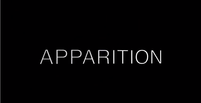
We decided to call our OTS 'Apparition' due to the constant present of a ghost like image within our OTS. The definition our our title means : 'a ghost or ghostlike image of a person'. Although the character is not being haunted by a ghost, we decided this title was fitting as the character was being stalked by a person who was able to take different forms - she was the therapist and also the presence that followed her. As a group we liked the idea of a one word name for our OTS; we went through many different choices and originally called our project 'Always there'. We looked into names such as 'Revenant' however a film was released around the same time with this title and we believed it wouldn't be as suiting for our product. |
|
|
Style and colour:
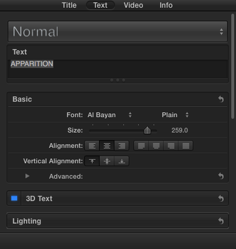
We chose to use a basic style font and a plain white colour to add to the affect of our OTS. We wanted to use something simple as our title to make the rest of the OTS flow better. Keeping the style simple meant that the title was clear and easy to read as well as not appearing overly complicated or messy on screen. We decided on the font Al Bayan in the size 259 as we believed it fit nicely on screen and appeared more aesthetically pleasing then anything else we tried. Through trial and error, using the guides and different sizes we trailed different fonts, sizes, colours and overall styles. We decided to make our title grow on screen and become larger - its final appearance was the title stretched across the screen in a larger font size (it grew slowly as the sequence moved forward). |
|
|
Editing decisions:
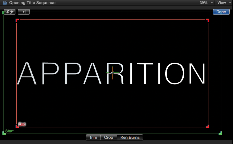
We chose to follow convention for where we placed our title; we decided on how long our title would appear on screen by comparing the average time of other titles in opening title sequences. We made our title grow on screen by using the crop tool and then selected the Ken burns effect. This allowed us to increase or decrease the size of our text on screen which we felt added to the overall finished result of our Title. |
|
